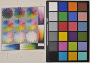
Spoonflower is fun. My first attempt came out 30% horribly though, lots of colors seemed to get shifted to black or white, so I decided to make a color chart so I could get it right next time. I think part of my problem may have been that I used a compressed tiff, although the preview looked right on their site, so I’m not sure. But anyway, having a printed color chart (on their fabric) is the only way to get the colors you want.
So I put one together and finally got it printed out. You can see the Spoonflower output up there with my GretagMacBeth color chart for comparison. You can also see how not-squared the fabric grain was when it was printed. It started out square, but once it was hand washed and ironed the grain straightened and the printing went crooked. Also you can see how grey the black is, which you expect from this sort of printing, but the saturated colors came out better than I was expecting.
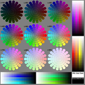
Here’s a jpeg RGB version, you can download the original uncompressed LAB tiff if you’d like to send it to Spoonflower yourself.
So what is this? The flowers are slices of the HSL color cylinder, each at a different lightness value (specified by the ‘L’ numbers next to each one), hue goes around the circle (obviously) and saturation goes from 100% at the rim to 0% in the center. Each rectangle patch contains lightness gradients from 100% down to 0% in 20 steps, for 3 hues each at 100% and 50% saturation. So all of the rectangle gradients together cover 12 hues spaced around the color wheel. (Does that make any sense? I need to go to bed.)
So now I can get to work. I’ve done 75% of the line drawings for a… hmm… robot/electronic/geek alphabet quilt. So I’m 10% of the way there… And the baby is only six months now. I better get to it. I think the fun part is making lots of small scale colorful patterns to interleave with the alphabet blocks. Hopefully the grain issues won’t be too much of a killer.


2 Comments
Add Yours →Having just started nosing around Spoonflower, this is really invaluable information. Thanks so much for posting!
Thanks for this! I haven’t washed any of my fabrics yet from Spoonflower, but I am pleased with the printing. This is helpful; thanks again.