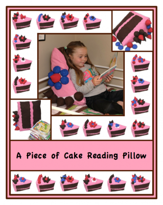
You can observe the evolution of the design. It is much better but still too busy, but my husband refocused me, by talking about what I wanted it to be showing, and I realized that I had gotten side tracked. I will probably use a different picture for the Etsy page, so no one will even see this unless they buy the pattern! So, GOOD ENOUGH! My patterns don’t even all have covers, several of them just have header images. Of course I didn’t realize this until I went through and masked all of the cakes, although, first I downloaded the demo of Photoshop Elements, it was like coming home to my comfy chair, so nice, except for the parts that have been nerfed from the full version, like curves! Sigh. There’s a good chance I’ll end up buying it anyway, it only took me minutes to clean the dirt off the wall and Rebecca’s face, and clean up her flyaway hair… I wasn’t going to do any of that, but it was soooo easy I couldn’t help it. But I will cry every time I use the crippled version of curves. (;_;)
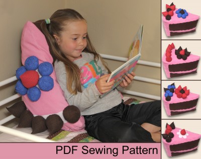
Here is what will probably be the Etsy thumbnail/main image. Much simpler, and paired with the title ‘A Piece of Cake Reading Pillow’, it gets the point across. (I hope!) It will have several support images of course, one of which may be a straight montage of 20 cakes.
Now you have gotten a glimpse into my highly distractible workflow!


6 Comments
Add Yours →Indeed the cover is still busy BUT I like it better, I like how you have two of the images (top right and bottom left) coming into the main picture. the 14 cakes around still “bother” me a little though, I am trying to think why/how. I think maybe I am finding it tiring for the eyes to have the white background and those pink pieces of cakes… that makes a bit of a contrast. How about trying a more creamy background colour?
The PDF thumbnail pic is fine. More direct, less busy.
Yes, it is still busy and contrasty, but I had to move on. The grid is made up of a table of images in Open Office, so if I wanted to change the color I would have to go in and tweak each of the images individually, once I got to the point of using Photoshop Elements I should have just redone the cover in that, then it would have been easy to change something like that, but as it is I’m trying to spend the little time I have on the more important things, as lovely as it would be to get distracted by falling into fixing this cover again. We’ll see if I just get distracted by something even *less* important… Thanks for your thoughts though!
🙂 It will do like this then, im sure! I was being picky in the hope to help ^^
You were very helpful. And I think you are still right. 🙂
I like the bottom photo 🙂
Yay!